Grids in Design
Jul 27, 2025
0:00/1:34
0:00/1:34
A grid is an important tool for maintaining balance and symmetry in design. It helps ensure consistent spacing and creates a visual structure that makes everything look clean and organized.
If you have ever looked at a website, magazine, or even a poster and thought, "Wow, this looks really organized," there was probably a grid behind the design, even if you did not see it.
You have probably seen grids in everyday things like:
• Magazines
• Websites
• Apps
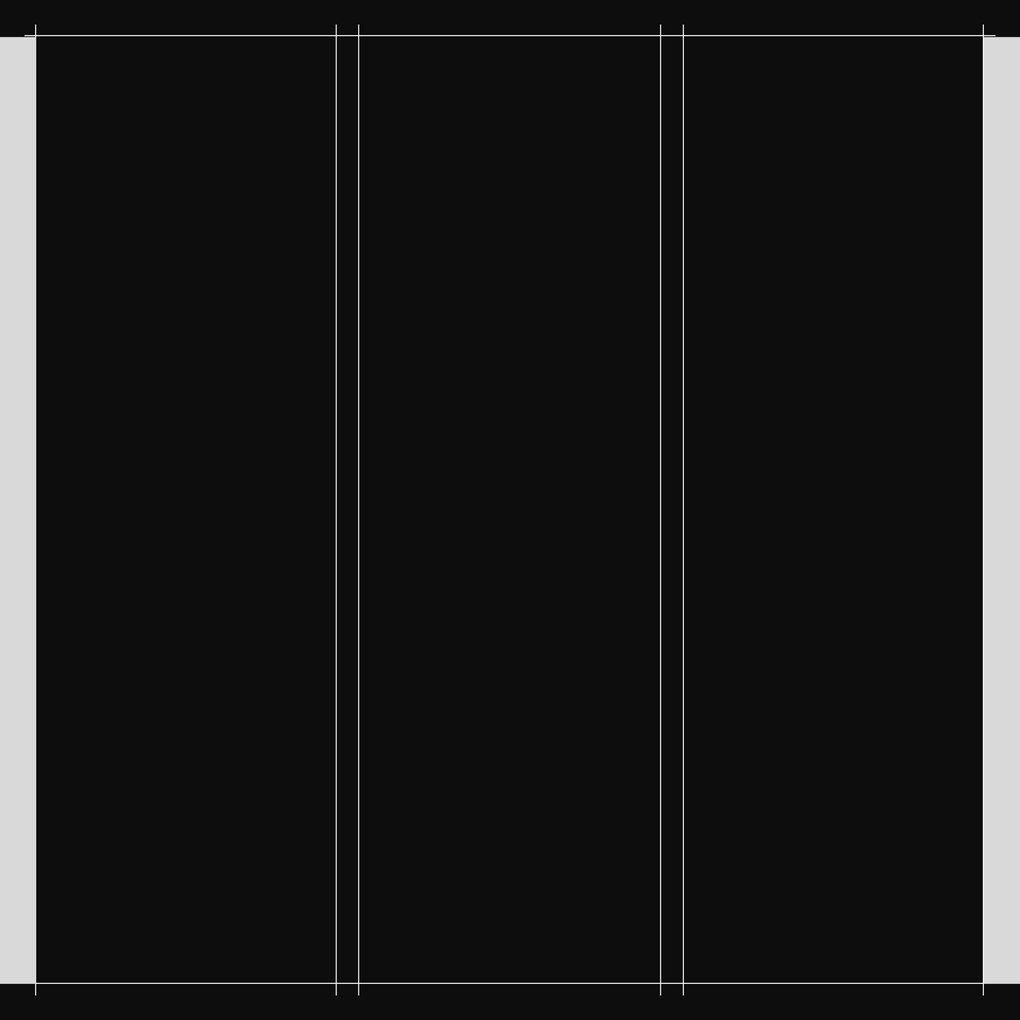
A Simple Grid could look like a book layout: Just one Column, margins based on traditional guidelines, and one spot for the page number. This kind of grid is very easy to use.
You may have heard words like columns, gutters, or margins before, but maybe you weren’t quite sure what they meant. Here is a quick explanation to help you understand these terms, especially if you've heard them from a designer and didn’t know what they were talking about.
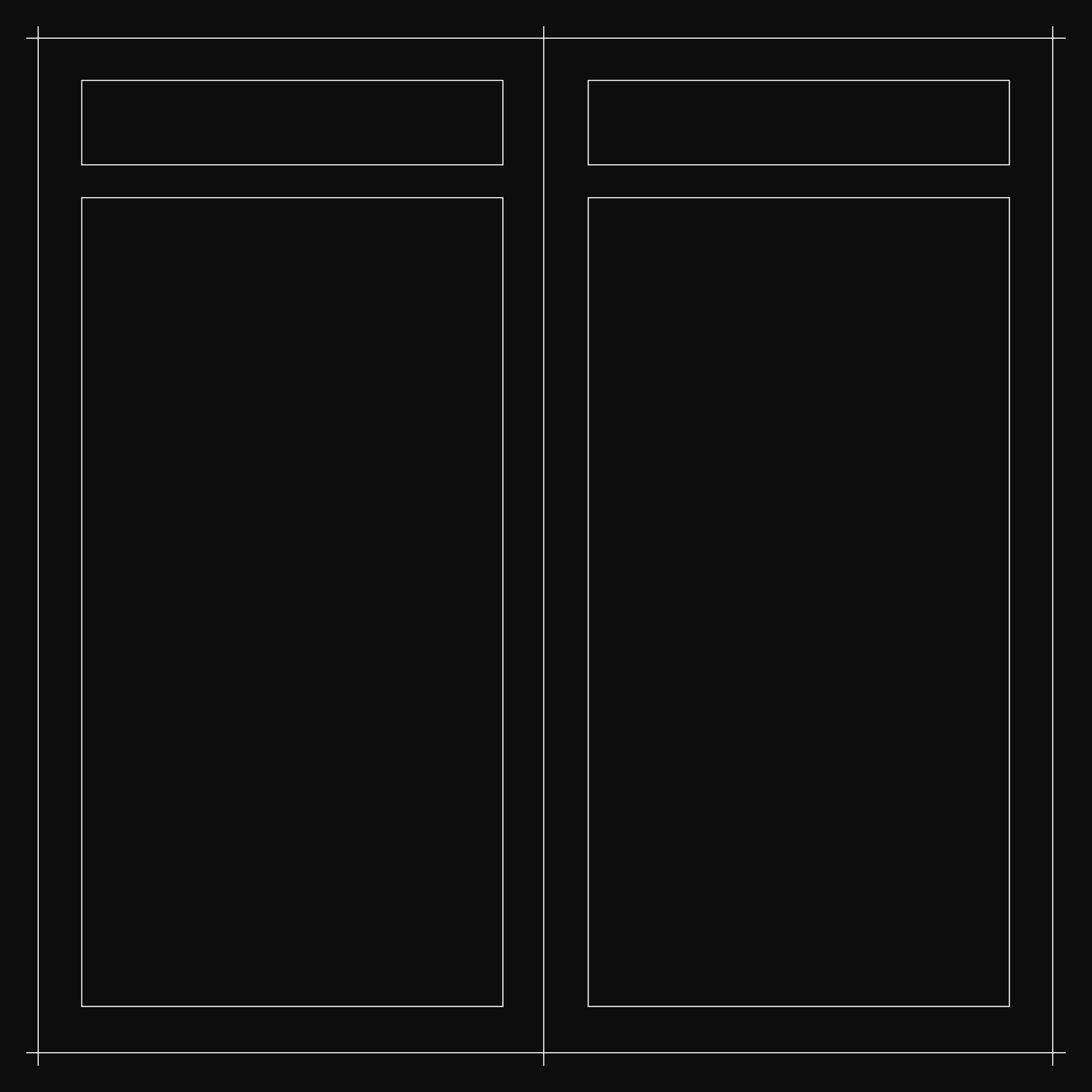
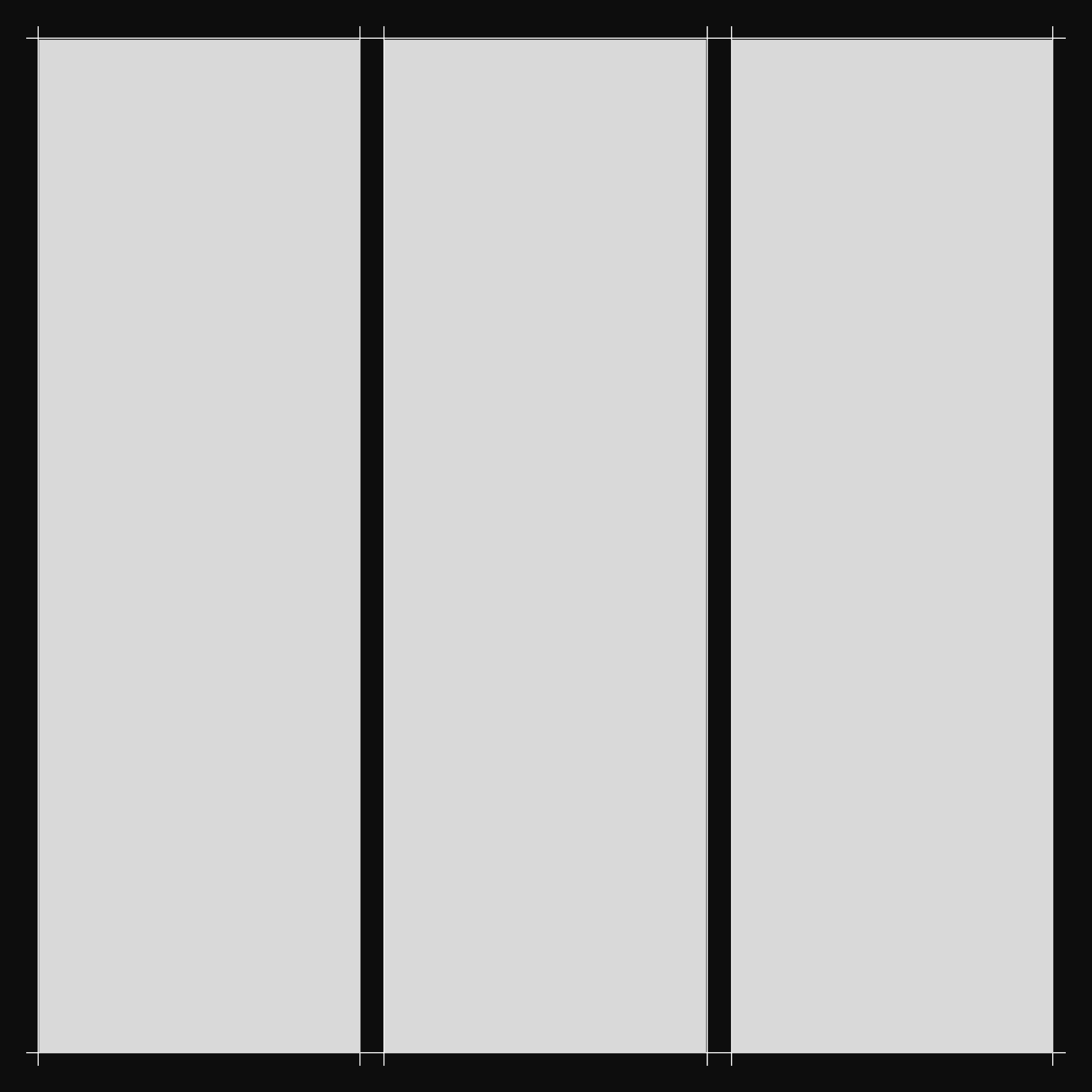
The Collumn
A column is one of the vertical sections within a grid. Columns are the main building blocks of the grid, helping to organize content and create structure in a design.
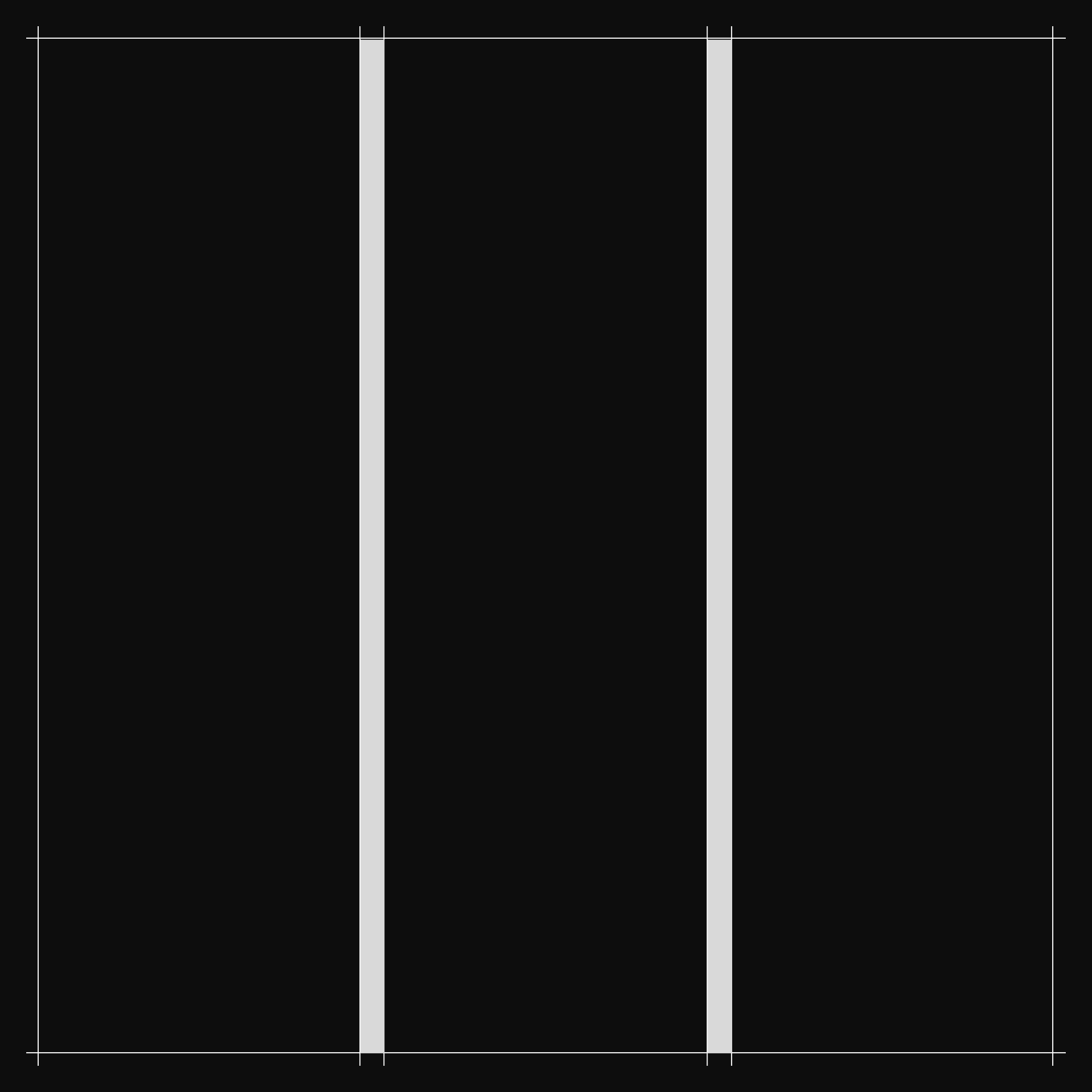
The Gutter
A gutter is the space between the columns. It acts like a gap that separates the columns from each other. Gutters make the design easier to read and help create breathing room between the content. Without gutters, the content would run into each other and look crowded.
The Margin
Then there are the margins. Margins are the spaces along the edges of a page or screen. They help frame the content and provide structure by keeping it away from the sides. Sometimes, the size of the margins is different from the gutters, meaning the space between the content and the page edges isn’t always the same as the space between columns.
UX / UI Design
Grids in Design
Jul 27, 2025
0:00/1:34
A grid is an important tool for maintaining balance and symmetry in design. It helps ensure consistent spacing and creates a visual structure that makes everything look clean and organized.
If you have ever looked at a website, magazine, or even a poster and thought, "Wow, this looks really organized," there was probably a grid behind the design, even if you did not see it.
You have probably seen grids in everyday things like:
• Magazines
• Websites
• Apps
A Simple Grid could look like a book layout: Just one Column, margins based on traditional guidelines, and one spot for the page number. This kind of grid is very easy to use.
You may have heard words like columns, gutters, or margins before, but maybe you weren’t quite sure what they meant. Here is a quick explanation to help you understand these terms, especially if you've heard them from a designer and didn’t know what they were talking about.
The Collumn
A column is one of the vertical sections within a grid. Columns are the main building blocks of the grid, helping to organize content and create structure in a design.
The Gutter
A gutter is the space between the columns. It acts like a gap that separates the columns from each other. Gutters make the design easier to read and help create breathing room between the content. Without gutters, the content would run into each other and look crowded.
The Margin
Then there are the margins. Margins are the spaces along the edges of a page or screen. They help frame the content and provide structure by keeping it away from the sides. Sometimes, the size of the margins is different from the gutters, meaning the space between the content and the page edges isn’t always the same as the space between columns.